Jetpack Compose实现滑块式标签tab
1. 先完成一个基本的tab

@Composable
fun SliderTabs() {
var selectedIndex by remember { mutableStateOf(0) }
val bgColor = Color(0xff1E76DA)
val list = listOf("Active", "Completed")
TabRow(
selectedTabIndex = selectedIndex,
backgroundColor = bgColor,
modifier = Modifier.padding(vertical = 4.dp, horizontal = 8.dp),
indicator = { tabPositions ->
TabRowDefaults.Indicator(
modifier = Modifier.tabIndicatorOffset(tabPositions[selectedIndex]),
color = Color.White
)
}
) {
list.forEachIndexed { index, text ->
val selected = selectedIndex == index
Tab(
selected = selected,
onClick = { selectedIndex = index },
text = { Text(text = text, color = Color.White) }
)
}
}
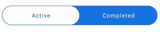
}2. TabRow改为胶囊样式

Modifier.clip(RoundedCornerShape(50))3. 指示器改为胶囊样式
Modifier
.tabIndicatorOffset(tabPositions[selectedIndex])
.fillMaxSize()
.padding(1.dp)
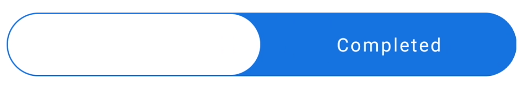
.clip(RoundedCornerShape(50))4. 文字置于上层,并且选中时改变文字颜色
指示器尺寸设置为fillMaxSize后遮挡了标签文字,需要将文字置于上层。
Modifier.zIndex(2f)
val textColor = if (selected) bgColor else Color.White
Tab(
    modifier = Modifier.zIndex(2f),
    selected = selected,
    onClick = { selectedIndex = index },
    text = { Text(text = text, color = textColor) }
)
5. 禁用点击水波纹效果
class NoRippleInteractionSource : MutableInteractionSource {
override val interactions: Flow<Interaction> = emptyFlow()
override suspend fun emit(interaction: Interaction) {}
override fun tryEmit(interaction: Interaction) = true
}
Tab(
modifier = Modifier.zIndex(2f),
selected = selected,
onClick = { selectedIndex = index },
text = { Text(text = text, color = textColor) },
interactionSource = NoRippleInteractionSource()
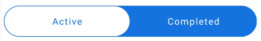
)6. 文字颜色添加渐变动画
val textColor = remember {
	Animatable(Color.White)
}
LaunchedEffect(
	selected
) {
	textColor.animateTo(if (selected) bgColor else Color.White)
}
Tab(
    modifier = Modifier.zIndex(2f),
    selected = selected,
    onClick = { selectedIndex = index },
    text = { Text(text = text, color = textColor.value) },
    interactionSource = NoRippleInteractionSource()
)
7. 完整代码
@Composable
fun SliderTabs() {
    var selectedIndex by remember { mutableStateOf(0) }
    val bgColor = Color(0xff1E76DA)

    val list = listOf("Active", "Completed")
    TabRow(
        selectedTabIndex = selectedIndex,
        backgroundColor = Color(0xff1E76DA),
        modifier = Modifier
            .padding(vertical = 4.dp, horizontal = 8.dp)
            .clip(RoundedCornerShape(50)),
        indicator = { tabPositions ->
            TabRowDefaults.Indicator(
                modifier = Modifier
                    .tabIndicatorOffset(tabPositions[selectedIndex])
                    .fillMaxSize()
                    .padding(1.dp)
                    .clip(RoundedCornerShape(50)),
                color = Color.White
            )
        }
    ) {
        list.forEachIndexed { index, text ->
            val selected = selectedIndex == index
            val textColor = remember {
                Animatable(Color.White)
            }
            LaunchedEffect(
                selected
            ) {
                textColor.animateTo(if (selected) bgColor else Color.White)
            }

            Tab(
                modifier = Modifier.zIndex(2f),
                selected = selected,
                onClick = { selectedIndex = index },
                text = { Text(text = text, color = textColor.value) },
                interactionSource = NoRippleInteractionSource()
            )
        }
    }
}